DbcultAccessing Vault...
Cult Review
Senior Film Conservator

If you have an hour to kill and like watching people from the 1920s look stressed out, you might actually enjoy this. It’s perfect for people who like old-school newsroom vibes and don't mind a plot that’s a bit thin on the ground. 📰
I wouldn't recommend it if you need a lot of action or a story that makes total sense. It’s more of a mood piece, honestly.
Carl Stockdale is the lead here and he spends a lot of time looking like he’s about to have a heart attack. He has this way of pointing his finger that feels like he’s trying to *physically poke* a hole in the air whenever he’s mad.
The whole thing feels a bit like The Man Who Could Not Lose, but with more ink stains and less luck. There’s this one guy in the background of the office scenes who is just destroying a typewriter, and I’m pretty sure there isn't even paper in it.
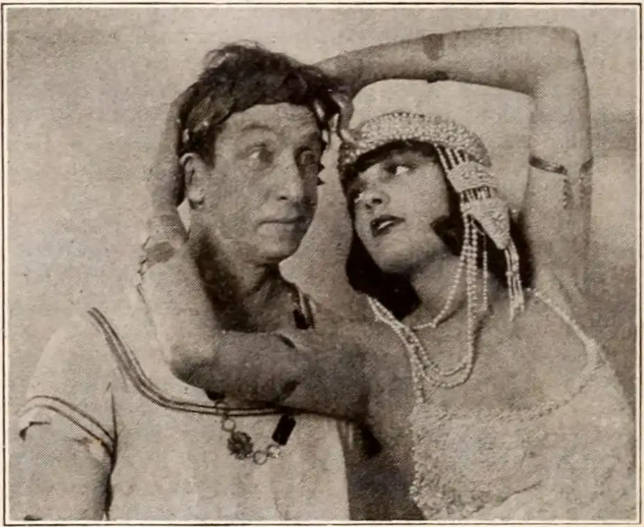
Raymond Hatton is also here, and his face is just built for silent movies. He looks like he’s perpetually smelling something slightly off, which works great for a cynical newspaper guy.
The set design is actually pretty cool if you like looking at old desks. They are incredibly messy, with piles of paper that look like they were just thrown there five minutes before the cameras started rolling. 🗄️
I noticed a smudge on the camera lens in one of the close-ups of Sam Hardy. It’s tiny, but once you see it, you can’t look at anything else for like three minutes.
Hardy is mostly just there to be significantly taller than everyone else in the room. He towers over the desks like a human skyscraper.
Maude Truax shows up and she has these absolutely massive hats. I spent way too much time wondering how she kept her balance while walking across the set.
The lighting in the main office is weirdly dark. It makes the whole place look a bit like a basement, even though it's supposed to be a big-shot newspaper building.
There’s a scene where they try to show a 'deadline' approaching. It’s basically just three guys running in a circle while waving blank sheets of paper. It’s not very organized, but it sure is energetic.
The writing by William Jacobs and Waldemar Young feels a bit like they were making it up as they went along. "Okay, now everyone look shocked! Now everyone sit down!"
I kept waiting for a reason for the name 'Caesar' to matter, but it really doesn't. It’s just a name, which feels like a missed opportunity for a good toga joke.
Compared to something like The Yellow Traffic, this is much lighter and doesn't try to teach you a lesson. It’s just people being frantic in a room full of ink.
Betty Lorraine is probably the most natural person on screen. She doesn't do that weird 'claw hand' thing that a lot of silent actors do when they are trying to look emotional.
One reaction shot of a clerk lingers for about five seconds too long. It goes from being a reaction to just a guy staring into your soul, and it’s accidentally hilarious.
The ending comes out of nowhere. It doesn't really wrap anything up, it just sort of... stops happening.
The print I watched was pretty grainy, which actually helped the atmosphere. You can almost smell the dust and the old cigarette smoke coming off the screen.
It’s a short watch, which is its biggest strength. It doesn't overstay its welcome or try to be more important than it is. ☕
If you're into the history of how movies used to handle comedy, give it a look. Just don't expect a life-changing story.
I liked the part where a typewriter nearly falls off a desk and the actor catches it with his knee. You can tell it wasn't scripted because he looks legitimately surprised for a split second.
IMDb 6.5
1926
Community
Log in to comment.